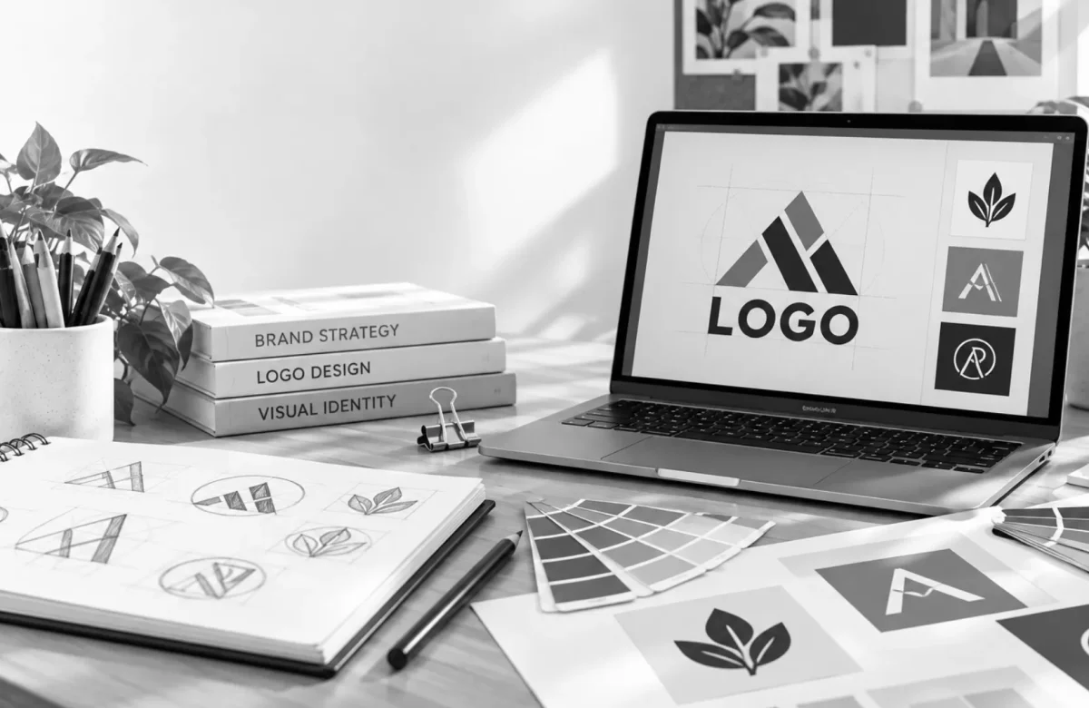
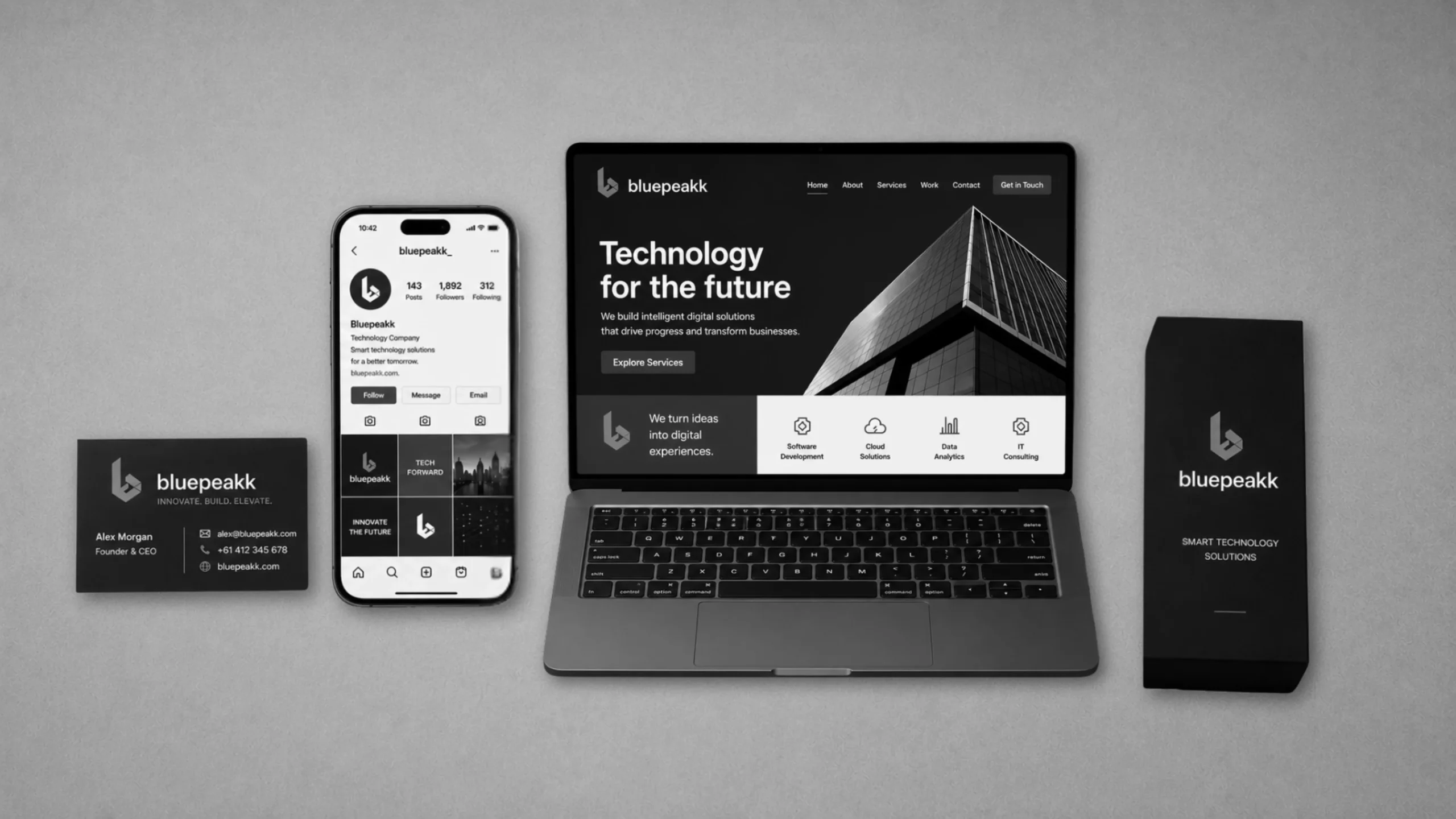
Your brand looks unprofessional despite having a logo because a logo is only one asset, not a full brand system. Without a defined colour palette, consistent typography, and clear usage rules, the logo gets pieced together with mismatched fonts, inconsistent colours, and low-quality images across your website, social media, and printed materials, and that inconsistency is what reads as unprofessional, not the logo itself.
You paid for a logo. It looked great in the file the designer sent over. But somehow, the business still doesn’t feel quite right. The website looks like it belongs to a different company. The social media doesn’t match. Something about the whole thing still reads as unfinished.
This is one of the most common and most frustrating experiences business owners run into after investing in design. The good news is it’s rarely about the logo itself. It’s almost always about everything around it.
Key Takeaways
• A logo is one design asset; a brand identity is the full system built around it. They are not the same thing
• Inconsistent fonts, colours, and image quality across your website and social media are the most common causes
• Getting only a logo file with no style guide leaves you guessing how to apply it everywhere else
• Keeping a brand consistent across every touchpoint can boost revenue by up to 23%, according to research cited by Lucidpress
• Saga Designs builds full brand identity systems, not just logos, so everything stays consistent from day one, boosting revenue by up to 23%, according to research cited by Lucidpress
• A simple self-check can reveal exactly where the inconsistency is coming from
• Saga Designs builds full brand identity systems, not just logos, so everything stays consistent from day one
Why Doesn’t a Good Logo Fix My Brand on Its Own?
A good logo doesn’t fix a brand on its own because a logo is just one visual element, and a brand is built from dozens of them working together consistently.
Think of a logo like a book cover. A strong cover gets someone to pick the book up, but if the writing inside doesn’t match the promise of that cover, the whole experience falls apart. A logo works the same way. It creates a first impression, but the impression only holds up if your website, your packaging, your social posts, and your printed materials all deliver on it consistently.
What Actually Makes a Brand Feel Unprofessional?
A brand usually feels unprofessional when its colours, fonts, and tone shift from one platform to another, not because any single piece looks bad on its own.
This shows up in small ways that add up. A website using a slightly different blue than the logo. A social media page with a totally different font in the bio. Product photos with no consistent style. Individually, none of these feels like a big deal. Together, they create a sense that the business isn’t quite put together, even if every individual piece was made by a skilled designer.
A separate, easy-to-miss cause is presentation quality rather than consistency. A logo that was only ever supplied at a small file size can end up pixelated the moment it’s placed on a banner or a large sign. Social media graphics built without a template often come out slightly misaligned from post to post. None of this is about the logo being wrong; it’s about the surrounding materials not being built to the same standard, and it reads as unprofessional just as quickly as mismatched colours do.
Keeping a brand consistent across every touchpoint can boost revenue by up to 23%, according to research cited by Lucidpress. That’s not a small number, and it’s a direct result of consistency, not of any one design element being better than another.
Is My Logo Doing All the Work Alone?
If your logo is the only piece of your brand that was ever properly designed, it’s very likely doing all the work alone, and that’s usually where the unprofessional feeling comes from.
A logo is meant to be the anchor a brand is built around, not the entire brand itself. If you’re not entirely sure what a logo design actually covers versus what a brand includes, that’s worth clarifying first. When a business commissions a logo and stops there, everything else, the website colours, the social templates, the packaging, often gets pieced together separately, by different people, at different times, with no shared system guiding any of it.
What Does a Full Brand Identity Include That a Logo Doesn’t?
A full brand identity includes exact colour codes for every brand colour, a primary and secondary typeface, defined image and photography style, and a written set of usage rules, on top of the logo itself, so every future piece of content follows the same visual rules automatically instead of being guessed at.
That last part matters more than it sounds. A colour written down as “our blue” gets interpreted differently by every person who touches it. A colour written down with its exact HEX and CMYK codes gets reproduced identically every time, on a screen, on a printed brochure, or on packaging.
This is the actual difference between commissioning a logo and building a brand identity, and it’s worth understanding clearly rather than assuming they’re the same thing. Our guide on logo design versus brand identity breaks down exactly where the line sits between the two.
Once those guidelines exist, anyone working on your brand, a new hire, a printer, or a social media manager, has a clear reference to follow, instead of guessing at what “on brand” actually means.
How Do I Know If My Business Needs More Than a Logo?
A simple way to know if your business needs more than a logo is to open your website, your social media, and your last piece of packaging or print material side by side and ask if they genuinely look like they belong to the same business.
If the answer is no, or even “sort of,” that’s usually the real signal. It’s rarely one obviously broken piece. It’s more often a quiet mismatch that’s hard to name until you see everything laid out together. For a closer look at what a complete brand identity system actually includes, our guide on what’s included in a brand identity package walks through it piece by piece.
What Should I Actually Do About This?
The most direct fix is to build a proper brand identity system around the logo you already have, rather than starting over with a new one.
In most cases, the existing logo doesn’t need to be thrown out. What’s usually missing is the system around it, defined colours, consistent typography, and clear guidelines that tie every future piece of content back to the same source. That’s a very different, and often faster, fix than commissioning an entirely new logo and hoping it solves the problem on its own.
Frequently Asked Questions
Do I need a new logo if my brand feels unprofessional?
Not necessarily. In most cases, the logo itself is fine; what’s actually missing is a consistent system of colours, fonts, and guidelines for it. A brand identity review often solves the problem without replacing the logo at all.
What is the difference between a logo and a brand identity?
A logo is a single visual mark. A brand identity is the complete system built around that mark, including colour palette, typography, tone of voice, and usage guidelines, that keeps everything consistent across every platform and material.
How much does it cost to fix brand inconsistency?
Costs vary depending on how much needs to be built out, from a simple guidelines document to a full brand identity system. It’s generally more affordable than most business owners expect, since the logo itself usually doesn’t need to be redone.
Can I fix brand inconsistency myself without hiring a designer?
You can address some of it yourself by documenting your exact colours, fonts, and tone and applying them consistently going forward. A designer becomes valuable when you want a complete, professional system built once and reused everywhere without ongoing guesswork.
Why does my logo look pixelated on some materials but not others?
This usually happens when a logo was only supplied as a small web-sized file, then stretched to fit a larger banner, sign, or print piece. A logo delivered in vector format scales to any size without losing quality, so this is typically a file format issue rather than anything wrong with the design itself.
Why does my website look different from my logo even though I use the same colours?
This usually happens when colours are chosen by eye rather than defined with exact colour codes. Without a specific HEX or CMYK value, the same “blue” can look noticeably different across a screen, a printed page, and a social media platform.
Conclusion
A logo alone was never meant to carry an entire brand, and if your business still feels unpolished despite a strong logo, the real fix usually isn’t a new logo at all; it’s building a consistent system around the one you already have. Saga Designs builds complete brand identity systems for businesses that want everything, from their logo to their packaging, to finally look like it belongs together. Get in touch for a free brand identity review.