To improve shelf appeal, focus on a clean design, readable fonts, the right color choices, and ensuring your product’s main benefit is visible within 3 seconds. Most bad packaging fails because it tries to say too much at once.
Why Packaging Design Tips Actually Matter
A shopper takes about 7 seconds to decide whether to pick up your product. That’s it. Seven seconds.
And most of that decision happens without them even thinking. It’s just a gut feeling. Does this look right? Does it look trustworthy? Does it look like something I’d want?
Good packaging design solves all three of those questions before the person even reads a word.
Here are 12 packaging design tips that actually work.
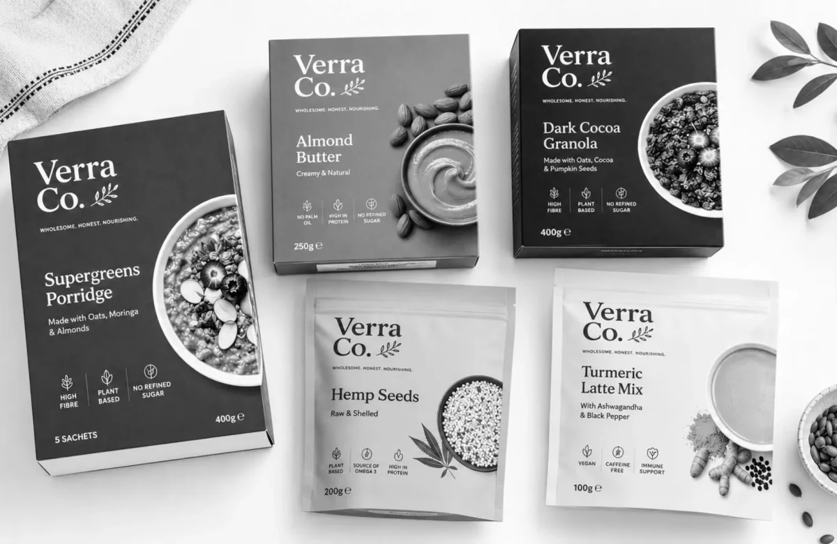
1. Make your main benefit obvious in 3 seconds
Walk up to your product on a shelf. Cover the brand name. What does it say?
If you can’t tell what the product does in 3 seconds, your packaging has a problem. Shoppers are not going to stand there and study your label. They are moving fast. Make it easy for them.
One clear benefit. Front and center. That’s the goal.
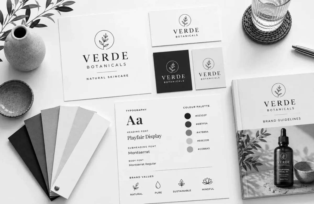
2. Use color with a purpose
Color is not just decoration. It tells the brain what to feel before the eyes even read anything.
Green = natural, organic, fresh Black = premium, luxury Yellow = energy, fun Blue = trust, calm, clean
Pick a color that matches what your product actually is. If you sell a budget snack, putting it in premium black packaging creates confusion. If you sell a wellness product, red might feel too aggressive.
Look at what your competitors use. Then decide if you want to blend in or stand out.
3. Keep the front panel clean
Less is almost always more.
New brands especially love to pack the front of their packaging with features, certifications, callouts, and slogans. The result looks like a ransom note.
Pick ONE message for the front. Everything else goes on the back or sides. A clean front panel feels confident. A cluttered one feels desperate.
4. Choose fonts that are easy to read, not just pretty
Script fonts look nice on a Pinterest board. On a shelf under bad lighting, from six feet away, they are impossible to read.
Use one or two fonts max. Make sure your product name is readable from a distance. If someone has to squint, they will not buy.
Simple rule: if your grandparent would struggle to read it, change the font.
5. Make sure your logo is not the only thing on the front
A lot of brands design packaging as if it were an ad for their brand. But shoppers want to know what’s inside the box, not just who made it.
Your brand name matters. But “Organic Oat Granola with Honey” in readable text matters more to a first-time buyer who has never heard of you.
Build trust with the product first. The brand follows.
6. Use white space the right way
White space (also called negative space) is the empty area around your design elements. It is not wasted space. It is breathing room.
Designs with enough white space look premium. They look thought-out. They give the eye a place to rest, which actually makes it easier to read the parts that matter.
If your packaging feels busy, try removing two things instead of adding one.
7. Match your packaging to your buyer
Think about who is actually buying your product. Then ask: Would this design appeal to that person?
A protein powder for college gym-goers looks different than one for 40-year-old dads. A baby product looks different from a teen skincare line.
The design should feel like it belongs in your customer’s world. Not just yours.
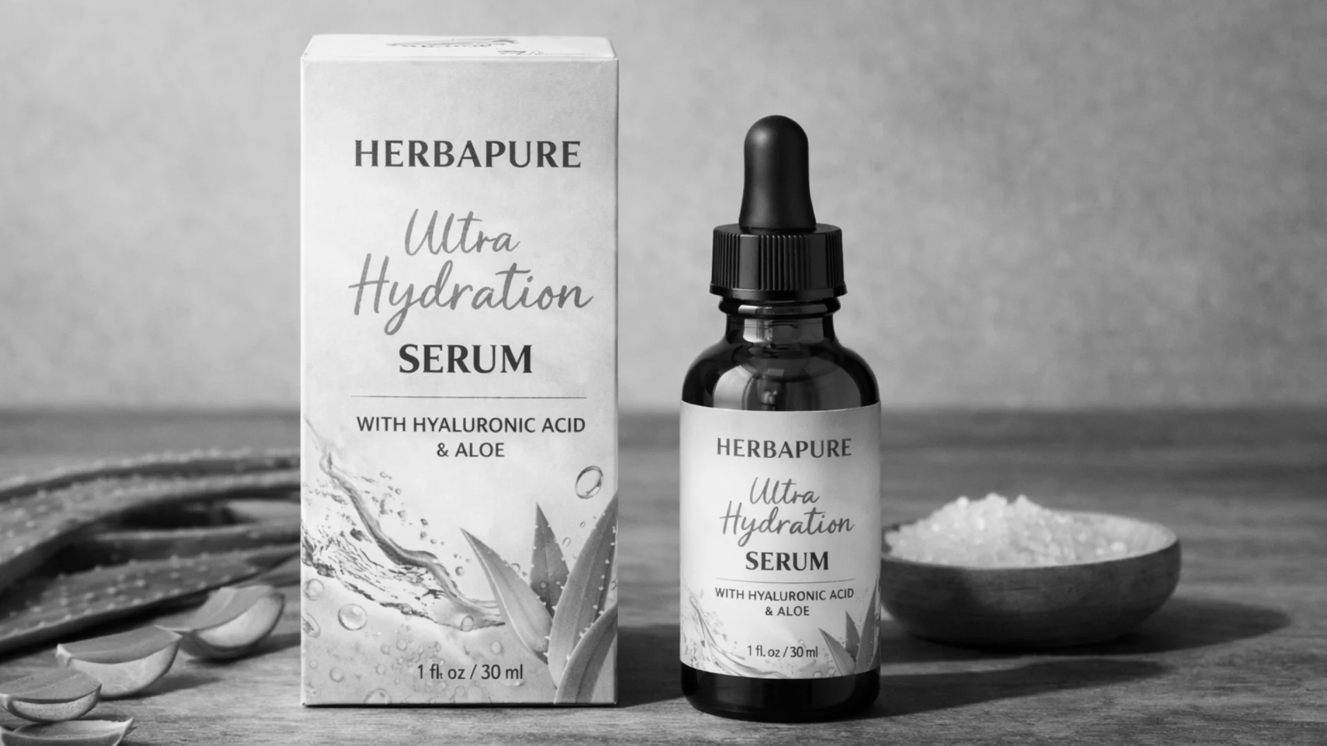
8. Use imagery that shows the product or the result
Photos and illustrations on packaging do one thing well: they help the shopper picture themselves using the product.
Showing a finished dish on a food product, a glowing face on a skincare item, or a clean kitchen after using a cleaner all work for the same reason. They sell the outcome, not just the product.
Bad imagery is worse than no imagery. Use real, sharp, well-lit photos or clean illustrations.
9. Make the size and weight obvious
People do not like surprises. If a box looks big but the product inside is small, that feels like a trick.
Use clear text for size, weight, quantity, or servings. Put it somewhere easy to find. This builds trust and reduces the moment of “wait, that’s all I get?”
10. Think about how it looks next to competitors
Go to the shelf where your product would live. Or find a photo of that shelf section online.
Now look at all the packaging side by side. What color is everyone using? What fonts? What style?
Now decide: do you want to fit in, or do you want to pop? Both are valid choices. But you need to make that choice on purpose.
A bright orange box in a sea of dark blue ones will get noticed. A design that looks just like the brand next to it will not.
11. Do not forget the secondary panels
The back and sides of your packaging are not throwaway real estate. Some shoppers flip products over before they buy.
The back should answer the question “Should I buy this?” clearly. Put your benefits, how to use it, ingredients if relevant, and any key selling points there.
The sides can carry certifications, brand story, or social handles.
Every panel is a chance to sell. Use it.
12. Test it before you print thousands of units
This sounds obvious. Most brands still skip it.
Before you finalize your packaging, print a mockup. Put it on a shelf next to real competitor products. Take a photo. Send it to 10 people who fit your target buyer. Ask them what they think the product is and if they would buy it.
You will learn more from that test than from weeks of looking at your design on a computer screen.
Printing 10,000 boxes with a design that confuses people is an expensive mistake.
Key Takeaways
• A shopper decides in 7 seconds or less. Design for that reality.
• Clean, simple designs work better than busy ones almost every time.
• Color communicates emotion. Use it on purpose.
• Match your packaging to your actual buyer, not your own taste.
• Always test a physical mockup before mass printing.
• The front panel has one job: make someone pick it up.
• Back panels sell. Use them properly.
FAQs
Q What makes packaging stand out on a shelf?
A: Clear messaging, smart use of color, and clean design are the packaging design tips that matter most at the shelf. If someone can tell what the product is and why it is worth buying in 3 seconds, the packaging is doing its job.
Q How many fonts should I use on packaging?
A: One or two. More than that starts to look messy and untrustworthy. Stick to one strong display font and one readable body font if you need variety.
Q Does packaging color really affect buying decisions?
A: Yes. Color influences mood and perception before the brain processes any words. Choosing the wrong color can make a healthy product look chemical or a premium product look cheap.
Q How do I know if my packaging design is working?
A: Print a mockup and test it. Ask real people from your target audience what the product is and if they would buy it. That feedback tells you more than any internal review.
Q Should I redesign my packaging if sales are low?
A: Not necessarily. If your product is not moving, packaging could be a factor, but so could pricing, placement, or the product itself. Test one thing at a time so you know what is actually causing the problem.
Q What is the most common packaging design mistake?
A: Putting too much on the front panel. Brands try to communicate everything at once and end up communicating nothing clearly.
Conclusion
Good packaging is not about being flashy. It is about being clear, honest, and designed for the person who is going to buy it.
Most products fail on shelves not because they are bad products, but because the packaging never gave them a fair shot.
If you want packaging that actually works, whether you are launching something new or refreshing an existing product, work with a team that understands both design and strategy.
At SAGA Designs, that is exactly what we do. We help brands create custom packaging design that gets noticed, builds trust, and turns shelf browsers into buyers. Reach out if you want packaging that does more than just look good.