Keep packaging consistent across a product range by locking a small set of fixed elements, your logo placement, primary colour, and layout, so they stay identical on every product, while allowing one or two flexible elements, like an accent colour or icon, to change between items. Without this, each new product drifts slightly from the last, and by the third or fourth item, the range stops looking like one brand.
If you’re new to packaging design generally, our guide on what packaging design actually involves is a good place to start before this one. If you’re building a product range, it’s easy to get the first item right and still end up with a mess by the third or fourth.
The fix isn’t complicated, but it does need deciding on purpose, not by accident. This guide breaks down exactly what should stay fixed, what’s allowed to change, and how to avoid the most common mistake that quietly wrecks a growing range.
Key Takeaways
- A packaging range needs a small set of fixed elements and a small set of flexible ones, not everything locked and not everything open
- Changing too many elements at once is the most common way ranges lose their consistency
- A real, well-documented case, Tropicana’s 2009 packaging redesign lost the brand an estimated 20% in sales within two months after changing too much at once
- Consistent packaging makes small brands look more professional and trustworthy, not just large ones
- Saga Designs builds packaging systems for growing product ranges, scaled for small businesses, not enterprise portfolios
What Should Stay the Same Across Every Product?
Your logo, its placement, your primary brand colour, and your overall layout structure should stay identical across every product in your range, since these are what customers recognise instantly, no matter which specific item they’re looking at.
This is the part most businesses get right without thinking too hard about it. The logo doesn’t move from product to product. The main colour someone associates with the brand stays the same too. What actually trips people up is everything just underneath that, the exact shade of that colour, the specific font weight, how much space sits around the logo. If none of that is written down anywhere, it drifts a little each time, especially if a different person designs the next product.
What’s Allowed to Change Between Products?
One or two clearly defined elements can change between products, usually a secondary colour, a small icon, or the product name itself, as long as the change follows a consistent pattern instead of being decided fresh every time.
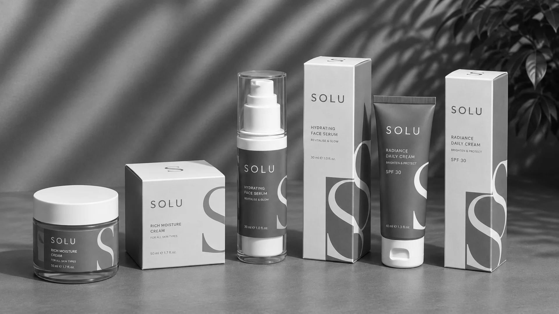
This shows up constantly in FMCG packaging design, where a single brand often manages a dozen flavours or variants at once. Skincare and haircare ranges are a good real-world example too. Many keep the bottle shape, the label layout, and the logo identical across every product, then use one different accent colour per variant, so a customer can tell products apart at a glance while still recognising the whole range as one brand. The variation has to be deliberate. Too small, and products blur together. Too different, and the range stops feeling like one brand at all.
What Happens If You Change Too Much at Once?
Changing several elements of your packaging at the same time is the fastest way to lose the recognition you’ve already built, and there’s a well-documented real example of exactly this going wrong.
In 2009, Tropicana redesigned its Pure Premium orange juice packaging, changing the logo, the layout, the colour palette, and the familiar straw-in-an-orange image all at once. Customers reportedly struggled to recognise the product on shelf, and the brand saw an estimated 20% drop in sales within about two months. The redesign was reversed shortly after.
The lesson isn’t that packaging should never change. It’s that changing everything at once removes every visual cue a returning customer relies on to find you again. If you’re refreshing an existing product, changing one element at a time protects the recognition you’ve already earned.
How Do You Test If Your Packaging Range Actually Works?
A simple test is asking whether someone standing a couple of metres from your product, or scrolling past it online, can tell which brand it is, what the product actually is, and which variant it is, all within about three seconds.
If someone needs to pick the product up and read the label carefully to answer any of those three questions, the range probably needs clearer visual hierarchy, not more information crammed onto the label. This test works whether your products sell on a physical shelf, through an online store, or both.
Why Does Colour Consistency Break Down Between Print Runs?
Colours can shift between print runs because of differences in paper stock, the printing machine, or the ink batch used, even when the design file itself hasn’t changed at all.
This catches out a lot of growing brands. Two products might be meant to use the exact same blue, but if one was printed months after the other, on a different material, the colours can come out visibly different once they’re sitting side by side. The fix is defining your brand colours with an exact colour code, a specific Pantone or CMYK value, rather than just “our blue,” and giving that same code to every printer you work with, every time.
Do You Need a Full Written Style Guide, or Just a Few Rules?
You don’t need a lengthy enterprise style guide to keep a small range consistent, but you do need your fixed rules written down somewhere other than one person’s memory.
A short, simple document covering your exact colour codes, your font, your logo placement rules, and a clear note on what’s allowed to vary between products is usually enough for a business with a handful of products. Our guide to custom packaging design decisions covers a few more of these choices in detail. It doesn’t need to be complicated. It just needs to exist, so the third product looks like it belongs with the first two, even if someone new designs it.
Consistent packaging also matters more than people expect for how trustworthy a brand looks. According to a Sealed Air survey, 66% of consumers feel packaging quality reflects how much a brand cares about their order, and 48% think it reflects the quality of the product itself. This isn’t just a design preference, it’s a real signal customers read into your brand, whether you intend it or not.
How Do You Stop Your Range From Looking Chaotic as You Grow?
Write your fixed rules down before launching your second product, not after your range has already started to drift, since fixing an inconsistent range later almost always costs more than setting the rules early.
According to Ipsos, 72% of consumers say packaging design influences their purchase decision. That number applies to a single product. Across a growing range, the effect compounds, either working in your favour because every product reinforces the same brand, or working against you because every product looks like a slightly different guess at what the brand should be.
Does My Packaging Need to Work Differently Online and In Person?
Yes, packaging often needs to work slightly differently depending on where customers actually see it, since a product on a physical shelf and a product in an online listing are being judged under very different conditions.
On a physical shelf, your packaging is seen at a normal distance, often next to competitors, with the whole product visible at once. In an online store, the same product is often first seen as a small thumbnail image, sometimes only a few centimetres wide on a phone screen. Details that read clearly in person can disappear entirely at that size. This doesn’t mean you need two different designs, but it’s worth checking that your logo and the most important information on the pack are still clear when the whole image is shrunk down small. This connects directly to how a product actually gets photographed and listed for ecommerce and social platforms, since a packaging design that only works at full size creates extra problems the moment it needs to be reduced for a product listing.
If your range sells across both channels, it’s worth testing your packaging design at thumbnail size before finalising it, not just looking at the full-size print proof, since that’s genuinely how a large share of customers will see it first. Some businesses solve this with 3D product renders instead of relying on packaging photography alone, since a render can be built specifically for how it needs to look at thumbnail size, then reused across every listing.
A Simple Example of Fixed and Flexible Elements in Action
Here’s what this looks like in practice for a small business with a growing range, using a made-up sauce brand as an example.
The fixed elements stay the same on every jar: the logo in the same position, the same brand font for the product name, the same cap colour, and the same jar shape and size across the whole range. Anyone glancing at the shelf knows instantly these products are from the same brand.
The flexible elements change deliberately: a different accent colour band around the base of each label, one colour per flavour, and a small icon representing that flavour, always placed in the same spot. Nothing about where these elements sit changes, only their content does.
The result is a range where a customer can tell it’s one brand and tell which flavour they’re looking at, in the same glance, without either signal getting in the way of the other.
Frequently Asked Questions
What is a packaging design system?
A packaging design system is a documented set of rules for what stays fixed and what’s allowed to vary across a product range. It doesn’t need to be complicated for a small business, a short document listing your colour codes, fonts, and logo rules is usually enough to get started.
Can small businesses really benefit from consistent packaging, or is it just for big brands?
Small businesses benefit just as much, if not more, since consistent packaging is one of the fastest ways to look established and trustworthy without a large marketing budget. It costs nothing extra to apply the same rules to every product from the start.
How much does it cost to fix inconsistent packaging across a range?
Cost depends on how many products need updating and how far they’ve drifted from each other. Fixing it earlier, before a range grows past a handful of products, is almost always cheaper than redesigning everything at once later.
Do all my products need to look almost identical to be consistent?
No. Consistency means shared fixed elements, like your logo and primary colour, not identical packaging. Products in a range should be different enough to tell apart at a glance while still clearly belonging to the same brand.
How often should I update my packaging once it’s consistent?
There’s no fixed rule, but changes work best when they happen gradually rather than all at once. Updating one element at a time protects the recognition customers have already built with your brand.
Does my packaging need to look different for online stores compared to in-store shelves?
Not necessarily a different design, but it’s worth checking your packaging is still clear at a small size, since online listings are often first seen as a thumbnail image. Details that read fine in person can disappear when the image is shrunk down for a product page.
Conclusion
Packaging consistency across a range isn’t about making every product identical; it’s about deciding once what stays fixed and what’s allowed to change, then writing it down before the range grows any further. Saga Designs, a packaging design agency in Melbourne, builds packaging systems for growing product ranges across Melbourne and Australia, sized for small businesses, not enterprise portfolios. Get in touch for a free quote based on your specific range.